|
|
Post by Darth Dianthus on May 5, 2009 20:04:06 GMT -6
Awesome! I'm very impressed, Empy, he looks great!
As for "Tibcaegtfdvhfragbebpbdvbcsstigotw" ... how do you pronounce that? I make it "tib-kay-get-fud-verf-rag-beb-pub-dev-bix-sty-got-wah".
|
|
|
|
Post by Darth Vilgore on May 10, 2009 11:34:37 GMT -6
yep. Soundz huteeze
|
|
|
|
Post by Empress Palpatine on May 10, 2009 17:15:48 GMT -6
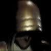
A few images for consideration. Potential award design:  Potential banner design: 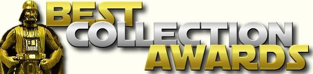 Potential avatar design:  |
|
|
|
Post by Darth Dianthus on May 10, 2009 21:01:44 GMT -6
Freakin' wonderful! Top work, Empy.
Love the banner and avatar! Can we see the avatar on a white background to tie in with the banner? Or is that a cream background?
The "BCA" label is a good size, since it will still be readable on the smaller avatar sizes (64x64 and 48x48).
I reckon they're just about ready to go up on BCA9 ... what does everyone else think?
I've asked for Boobius' input on the award design and whether they're able to do the BCA8 badges.
|
|
|
|
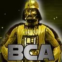
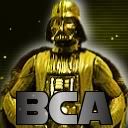
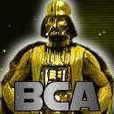
Post by Darth Boobius on May 11, 2009 12:15:06 GMT -6
The only bits of constructive criticism are; on the award badge Vaders right foot is a bit distorted & he could use a drop shadow, I think the word "Collection" in the banner should be gold & how about using the WoSW background in gold, the avi would look better all gold as well. Hope you don't mind Empy, but I did some mock ups of what I was talking about. I up for making the badges, just let e-mail me all the specs and it's as good as done.[/b]
<a href="http://s132.photobucket.com/albums/q24/robertrodriguez83/Star%20Wars%20Art/?action=view¤t=sampleaward.jpg" target="_blank"><img src="http://i132.photobucket.com/albums/q24/robertrodriguez83/Star%20Wars%20Art/sampleaward.jpg" border="0" alt="BCA Award"></a>
<a href="http://s132.photobucket.com/albums/q24/robertrodriguez83/Star%20Wars%20Art/?action=view¤t=banner2-2.jpg" target="_blank"><img src="http://i132.photobucket.com/albums/q24/robertrodriguez83/Star%20Wars%20Art/banner2-2.jpg" border="0" alt="BCA Banner"></a>
<a href="http://s132.photobucket.com/albums/q24/robertrodriguez83/Star%20Wars%20Art/?action=view¤t=av1.jpg" target="_blank"><img src="http://i132.photobucket.com/albums/q24/robertrodriguez83/Star%20Wars%20Art/av1.jpg" border="0" alt="BCA Avi"></a>
|
|
|
|
Post by Darth Boobius on May 11, 2009 12:18:00 GMT -6
|
|
|
|
Post by Empress Palpatine on May 11, 2009 16:09:11 GMT -6
The distortion of his foot came by my trying to change its position. It was more or less falling off the stand's top. You're right, I should have cleaned it up better.
I threw the silver in the banner to add some contrast to it. I personally think the silver sandwiched between the gold looks better than it did when I tried all of the text in gold, but that's just me.
If we want to use the gold WOSW background for the avatar, awards, etc., we should probably use the white shadow around Vader/the award, to help him/it stand out better.
I agree, the white background for the banner is on the dull side. I couldn't decide what to do with it and ended up deciding to present it plain white for the time being.
Go ahead and register for an account on this board, Boobius. We can use your imput on all matters BCA.
|
|
|
|
Post by darthboobius on May 11, 2009 17:54:06 GMT -6
All done!
|
|
|
|
Post by Darth Dianthus on May 11, 2009 18:57:26 GMT -6
I love the gold starfield background, when the white shadow is used around the Vader statue - without the white shadow his cloak disappears. Could we also use the white shadow around the statue in the avatar?
The problem that I see with the gold text - in the avatar - is that it doesn't contrast against the gold statue itself. Plus using it alone in the banner sort of makes everything gold ... statue, text, stars, all gold. I prefer the look of the silver "BCA" in the avatar for visibility, and also using silver for the word "Collection" in the banner, for a bit of variety (plus the gold combined with silver really reinforces the "award" theme).
I also like black, gold and silver because they're tinctures in heraldry, which makes it easy to describe the avatar I'm after in blazon: Sable, a semé of stars, a Vader affronté Or, a "BCA" in base Argent. See? Much easier to understand. Heh, I love blazon.
I'm really really impressed with the work, Empy and Boobius! Great stuff!
I'll e-mail you the details for the badges, Lord Boobius. Thanks for your help!
|
|
|
|
Post by Empress Palpatine on May 12, 2009 13:57:40 GMT -6
Hope I'm not the only one who had to look some of those words up. I've put together 2 simple banners for the competition/episode numbers:   And 2 versions of a white-shadowed av:  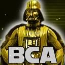 |
|
|
|
Post by darthboobius on May 12, 2009 18:36:41 GMT -6
|
|
|
|
Post by Darth Dianthus on May 13, 2009 6:30:46 GMT -6
No man, it's my eyes popping more! They're freakin' awesome! The Vader statue looks more real and 3Dish. Your banner with the fantastic episode number from Empy will be great topping the page.
And I love the avatar, Empress - perfect decoding of the blazon!
|
|
|
|
Post by darthboobius on May 13, 2009 11:02:55 GMT -6
Empress, what's the name of that font you used for the award badge? Can you send me a copy of it with no text? Do you want me to upload a copy of the banner with no text so you can put the new awesome text?[/color]
|
|
|
|
Post by darthfather on May 13, 2009 11:13:45 GMT -6
That is an awesome looking avatar!
|
|
|
|
Post by Empress Palpatine on May 13, 2009 16:40:21 GMT -6
|
|